
😱 5 Design Mistakes That Are Killing Your Brand Image

Your brand image is built through every single visual touchpoint with your audience. Every flyer, every social media post, every page on your website shapes how people perceive your company. Unfortunately, many businesses make serious design mistakes that slowly but surely erode their credibility. These errors often go unnoticed by those who commit them… but they immediately stand out to your potential customers.
Here are the five most common mistakes — and more importantly, how to avoid them to protect and strengthen your brand image.
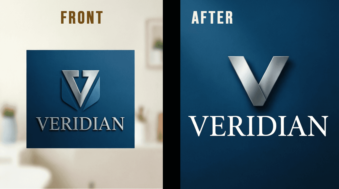
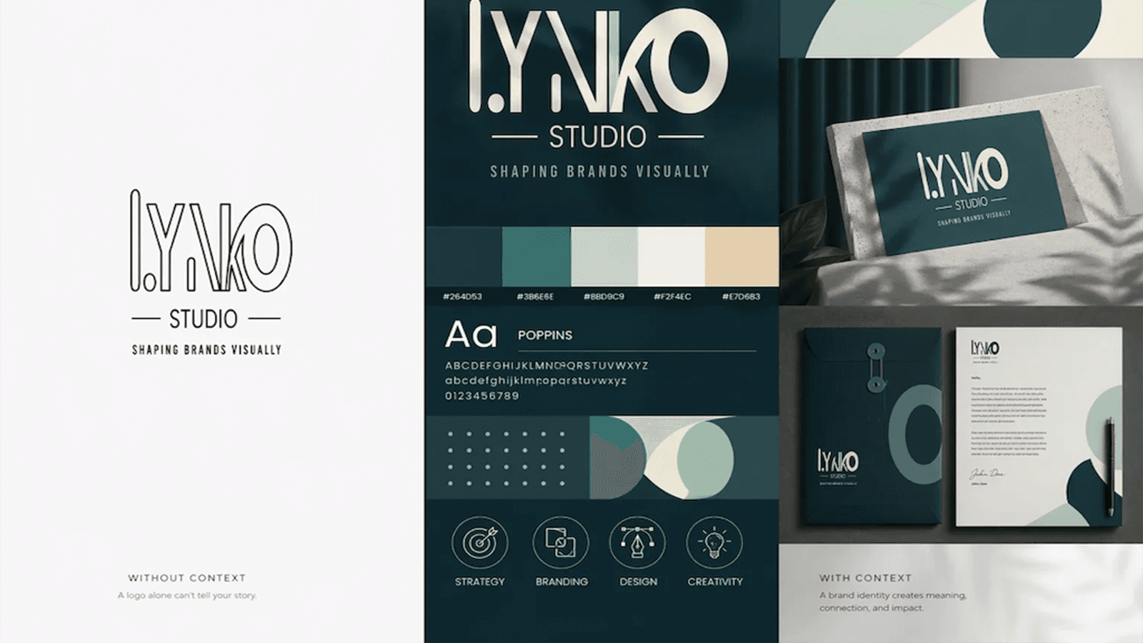
1: Visual Inconsistency Across Platforms This is by far the most widespread error. Your website uses blue and green, your business cards are red and black, your Instagram feed is pastel pink, and your printed brochure is navy blue. Result? Your audience no longer recognizes your brand from one medium to the next. Visual inconsistency creates confusion and makes your brand look disorganized — or even amateurish. The solution is simple but requires discipline: create a precise brand style guide and apply it rigorously to every single touchpoint, without exception.
2: Using Too Many or Inappropriate Fonts Typography is a fundamental design decision that dramatically affects readability and brand personality. The classic mistake? Using too many different fonts on the same medium, creating visual chaos. Another common error is choosing overly decorative fonts for body text, making reading tiring and frustrating. Best practice: limit yourself to two (maximum three) fonts — one expressive font for headlines, one highly readable font for body text, and possibly a third for accents (quotes, callouts, etc.). Typographic harmony is a subtle but powerful sign of professionalism.
3: Ignoring Visual Hierarchy Visual hierarchy is the art of guiding your audience’s eye through your content in a logical, intuitive way. Without clear hierarchy, your design becomes a dense, undifferentiated wall of text and images. The reader doesn’t know where to look first, what the main message is, or what action to take. To create effective hierarchy, use size, font weight, color contrast, and spacing strategically. Your headline must be instantly noticeable, subheadings should organize the content, and secondary information should be present but not compete for attention. Good design naturally leads the eye from the most important element to the supporting details.
4: Fear of White Space (Negative Space) White space — also called breathing room or negative space — is often mistakenly seen as wasted space. Many entrepreneurs try to fill every millimeter with text, images, and graphics, thinking that more content = stronger message. It’s the exact opposite. White space lets your content breathe, improves readability, highlights key elements, and conveys sophistication and quality. The most premium brands often use the most white space. Apple is the ultimate example — their ads and website are masterclasses in minimalist elegance. Don’t be afraid of emptiness. It’s one of the most powerful tools in design.
5: Using Low-Quality or Generic Images A blurry, pixelated, poorly cropped, or overused stock photo can destroy your credibility in seconds — especially in the age of high-speed internet and Retina screens where every flaw is visible. Free stock photo libraries are convenient, but there’s a high risk your competitor is using the exact same image. Invest in professional photography or at least premium stock images. When budget is tight, it’s better to use a few high-quality images than many mediocre ones. Custom illustrations are also an excellent way to strengthen your unique identity.
These five mistakes are extremely common… but 100% avoidable.
The key? Work with a graphic design professional who truly understands core design principles and can apply them consistently and creatively to your brand.
Never forget: your visual identity is often the very first contact a potential client has with your company. It deserves your full attention— and proper investment.
Your brand deserves better than avoidable mistakes.
Let our online graphic design studio transform your visual communication.